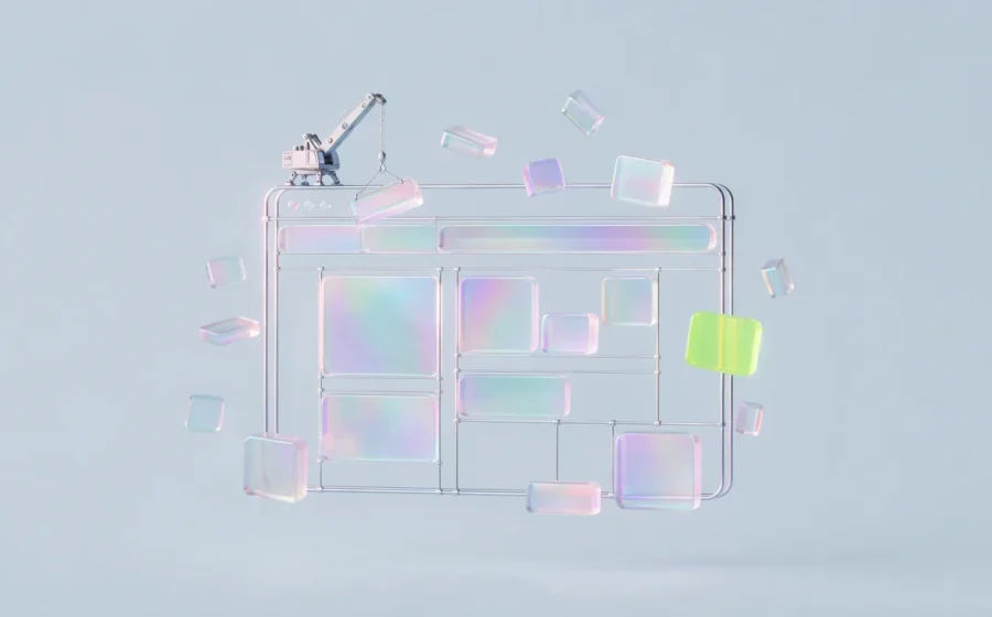
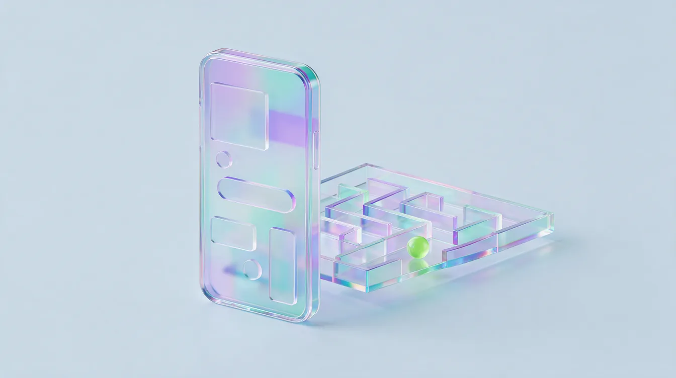
People say “UI UX design” like it is one word. It is not. It is two jobs that sit very close together, argue a lot, and need each other to be any good.
Here is the short answer. UX (user experience) design is about how a product works: what a person is trying to do, the steps they take, and whether they get there without wanting to throw their phone. UI (user interface) design is about how the product looks and feels on screen: layout, type, colour, buttons, icons, spacing and motion. UX decides that checkout should take three steps instead of seven. UI decides what those three screens look like.
A simple way to hold it in your head: UX is the route, UI is the road. A beautiful road that goes to the wrong place is still useless. A perfect route on a road full of potholes still makes people turn back. You need both, and you need them designed together.
The rest of this guide goes deep. What each discipline actually involves, how a proper UI and UX process runs, what you should expect to be handed at the end, what it costs in India, how to hire, and the mistakes we see founders make again and again.
UI vs UX: the difference in one table
If you only read one section, read this one.
| UX design | UI design | |
|---|---|---|
| Core question | Does this work for the person using it? | Does this look clear, consistent and on brand? |
| Focus | Journeys, flows, structure, logic | Visual layout, type, colour, components |
| Typical outputs | Research notes, user flows, sitemaps, wireframes, prototypes | Visual designs, design system, icons, interaction states |
| Tools | Interviews, analytics, Figma, FigJam, usability testing | Figma, design tokens, prototyping and motion tools |
| Measured by | Task success, drop offs, conversion, support tickets | Clarity, consistency, accessibility, brand fit |
| When it goes wrong | People get lost, stuck or confused | People do not trust it, cannot read it, or tap the wrong thing |
| Good analogy | The architect’s floor plan | The interiors, finishes and signage |
Both columns care about the user. UI is not decoration and UX is not a spreadsheet.
What UX design actually involves
UX is the part people underestimate because a wireframe is grey boxes and nobody posts a sitemap on Instagram. But this is where most of the value lives. Good UX work usually covers these things.
Understanding the user. Who is using this, what are they trying to get done, and what is getting in the way? This comes from talking to real customers, watching session recordings, reading support tickets and app store reviews, and looking at analytics. For an Indian D2C brand that might mean noticing that half your buyers are on mid range Android phones with patchy data. For a B2B SaaS product it might mean realising the person signing the cheque is not the person using the dashboard.
Information architecture. How content and features are organised and named. What goes in the main menu, what lives three taps deep, and what labels people will actually understand. “Solutions” means nothing. “Pricing” means something.
User flows. The step by step path for each key task. Sign up, find a product, apply a coupon, book a demo, raise a refund. Every extra step, field and decision is a chance for someone to leave.
Wireframes. Low detail layouts of each screen that show structure and priority without colour or polish. They exist so you can argue about the right things (what goes where) before anyone argues about the wrong things (whether the button should be teal).
Prototypes and testing. Clickable versions of the flow, tested with real people before a developer writes a line of code. Five users trying to complete a task will show you most of the obvious problems. It is the cheapest insurance in product building.
What UI design actually involves
UI is where the product gets its face. It is also where trust is won or lost in about two seconds.
Visual hierarchy. What the eye sees first, second and third. The most important action on a screen should be obvious without anyone having to think.
Typography and colour. Readable sizes on small screens, enough contrast for people using their phone in direct sunlight on a Mumbai local, and a palette that matches your brand without turning every screen into a festival.
Components. Buttons, inputs, cards, tabs, modals, toasts, empty states, error states, loading states. Every one of them designed once, properly, and reused everywhere.
Interaction and motion. What happens when you tap, swipe, wait or make a mistake. Small motion tells people the app heard them. Too much motion makes it feel slow and show offy.
Accessibility. Contrast ratios, tap target sizes, readable fonts, support for screen readers, and not relying on colour alone to show meaning. This is not a nice to have. It makes the product better for everyone, including your customer with cracked glasses and a 5.5 inch screen.
The design system. A shared library of colours, type styles, spacing rules and components, usually in Figma, that keeps the product consistent as it grows. Without one, every new screen is a fresh guess, and in six months your app looks like it was designed by a committee. Because it was.
If your brand identity is still fuzzy, UI design will expose it fast. It helps to sort out what your brand identity actually is before you design two hundred screens on top of it.
How a good UI and UX design process runs
Every agency has a process diagram with five hexagons on it. Here is what the work actually looks like when it is done properly, step by step.
- Kickoff and goals. Agree on what success means in numbers. More completed signups, fewer cart drop offs, fewer “how do I” support tickets, higher demo bookings. If nobody can say what should improve, the project will be judged on taste, and taste is a terrible referee.
- Audit what exists. For a redesign, review the current product, analytics funnels, heatmaps and recordings. Find where people drop off and why. For a new product, audit three to five competitors and note what they get right and wrong.
- Research. Talk to six to ten real users or potential users. Not your cousin, not your investors. Ask about the last time they tried to do the task, not what they would like in theory.
- Define the structure. Sitemap, feature priority, and the core user flows. This is where you cut. Most products get better when you remove a third of what was planned.
- Wireframe the key screens. Start with the screens that make money or lose users: home, product or listing, checkout or signup, dashboard. Review them on an actual phone, not just a big monitor.
- Prototype and test. Link the wireframes into a clickable flow and watch five people use it. Fix what confuses them. Repeat if the changes are big.
- Visual design. Now the UI work goes deep. Apply the brand, design every state, and build the component library as you go.
- Design system and handoff. Organise the Figma file so developers can build from it: named components, spacing tokens, responsive behaviour, edge cases, and annotations for anything tricky.
- Build support and QA. Designers should review the built product before launch. Something always shifts between Figma and code. Catching it before customers do is the job.
- Measure and iterate. Compare the numbers against the goals from step one after launch. Then improve the worst performing screen first.
Smaller projects compress this. A landing page does not need ten user interviews. But the order matters: understand, structure, test, then polish. Teams that start with polish end up redesigning twice.
What you should get at the end of a UI UX project
Founders often do not know what to ask for, so they get a handful of pretty screens and a “let us know if you need anything.” Here is a checklist of deliverables for a typical app or web product project. Not every project needs all of them, but you should know they exist.
- A short research summary: who the users are, what they struggle with, and what changed in the plan because of it
- Sitemap or app structure
- User flows for every core task
- Wireframes for key screens
- A clickable prototype of the main journeys
- Usability test notes with what was changed
- Final visual designs for every screen, in both mobile and desktop where relevant
- All states: empty, loading, error, success, disabled, first time use
- A design system in Figma with colours, type, spacing, icons and reusable components
- Developer handoff notes and a walkthrough call with your tech team
- Design QA of the built product before launch
If your designer hands over screens with no empty states and no error states, your developers will invent them. They will not invent them well.
What UI UX design costs in India
Prices vary wildly, so here are rough ranges based on what we typically see in the Indian market. Treat them as estimates, not a rate card.
| Project type | Freelancer (typical) | Agency or studio (typical) | Usual timeline |
|---|---|---|---|
| Landing page or small marketing site | ₹15,000 to ₹75,000 | ₹75,000 to ₹3 lakh | 1 to 4 weeks |
| Website redesign, 10 to 25 pages | ₹50,000 to ₹2 lakh | ₹2 lakh to ₹8 lakh | 4 to 10 weeks |
| MVP mobile or web app | ₹1 lakh to ₹4 lakh | ₹4 lakh to ₹15 lakh | 6 to 12 weeks |
| Complex SaaS product or redesign | ₹3 lakh and up | ₹10 lakh to ₹40 lakh and up | 3 to 6 months |
| UX audit of an existing product | ₹20,000 to ₹80,000 | ₹1 lakh to ₹4 lakh | 1 to 3 weeks |
What moves the price: the number of unique screens, how much research is included, whether a design system is built, how many rounds of revision you get, and whether the team supports development after handoff. Design is usually a fraction of what you will spend building the product, so it is worth getting right. If you are budgeting the full build, our guide to website development cost in India covers the other side.
One honest warning. A cheap quote often means the research and testing steps quietly disappear. You get UI with no UX underneath. It looks great in the pitch deck and leaks users in production.
How to hire for UI and UX
You have three broad options, and the right one depends on your stage.
A freelancer works well for a defined, smaller scope: a landing page, a quick audit, a set of screens for an existing system. Cheaper and faster, but you carry the project management, and one person rarely has deep strength in both research and visual craft.
An in house designer makes sense once design is a daily need, usually when you have a live product, a dev team shipping weekly, and a roadmap. Your first hire should usually be a product designer who can do both UX and UI reasonably well, not a pure visual specialist.
An agency or studio fits when you need a full team for a defined period: a new product, a major redesign, a rebrand plus product refresh. You get research, UX, UI and design systems under one roof, and someone else does the coordinating.
Whoever you hire, run this checklist before signing.
- Ask to see process, not just final screens. Wireframes, flows, test notes. If all they show is Dribbble shots, you are hiring a decorator.
- Ask what changed after user testing on a past project. A good answer has specifics.
- Ask how they hand off to developers. “We share the Figma link” is not a handoff.
- Check that their past work is live and usable. Download the app. Try the checkout.
- Ask how they would measure success on your project. If they talk only about how it will look, keep looking.
- Make sure you own the source files, fonts licensing is sorted, and the design system is included.
Common UI UX design mistakes
We see these on almost every audit.
Designing for the founder, not the user. The founder loves the dark mode hero with a moving 3D shape. The user wants to find the price. Guess who pays.
Skipping research because “we know our customers”. You know your best customers. You do not know the ones who left without buying. They are the ones you need to hear from.
Desktop first design for a mobile first country. Most Indian traffic for consumer brands is on mobile, often on mid range Android devices. Design and test on that phone first. Then make the desktop version nice.
Too many fields. Every form field costs you signups. Ask for the phone number now and the date of birth later, if ever. OTP login exists for a reason.
Ignoring performance. A heavy UI with autoplay video and five fonts loads slowly on a 4G connection in a crowded area. Slow is a UX problem, even if it is technically “a dev thing”.
No design system. Ten shades of blue, six button styles, and a spacing scale that changes per screen. It makes the product feel cheap and makes every new feature slower to build.
Pretty landing pages that argue nothing. Visual polish does not make a page persuasive. Structure and message do. We wrote a whole piece on why landing page design is an argument, and the same logic applies to product screens.
A quick worked example
Say you run a D2C skincare brand. Your site gets decent traffic from Instagram ads, but conversion is low and abandoned carts are high.
A UI only fix would be new colours, nicer photos and a fancier font. Probably nothing changes.
A proper UI and UX approach looks like this. The audit shows most visitors land on a product page from a Reel, on mobile. Session recordings show people scrolling past the price looking for ingredients and “is this for my skin type”. The add to cart button disappears below the fold. Checkout forces account creation before payment. Cash on delivery is hidden under “other options”, even though a big share of first time buyers in India prefer it.
So the UX changes are: a sticky add to cart button, a skin type selector near the top, ingredients and how to use in short expandable sections, guest checkout with OTP, and COD shown upfront. Then the UI work makes all of that clean, readable and on brand. Same traffic, same product, a much better chance at a sale. That is the difference between redecorating and designing.
FAQ
What is the difference between UI and UX in simple words?
UX is how a product works and feels to use: the steps, structure and logic. UI is how it looks on screen: layout, colours, type and buttons. UX makes sure people can get what they came for, and UI makes that path clear and attractive.
Is UI UX design a good career in India?
Demand for product designers has grown steadily as more Indian startups and enterprises build apps and digital products. Entry is competitive, and a strong portfolio that shows your process matters far more than any certificate. Learn Figma well, do real projects, and show how you solved problems, not just how screens look.
Do I need both a UI designer and a UX designer?
For most small and mid size projects, one strong product designer who can handle both is enough, or an agency team that covers both. Larger products with complex research needs often split the roles. What you should never do is skip UX entirely and only pay for visuals.
Which tools are used for UI and UX design?
Figma is the standard for interface design, prototyping and design systems, and FigJam or similar whiteboards are common for flows and workshops. Research uses interviews, analytics, heatmaps and session recording tools. The tool matters much less than the thinking behind it.
How long does a UI UX design project take?
A landing page can take one to four weeks. An MVP app usually takes six to twelve weeks of design. A complex SaaS product or a full redesign can run three to six months, depending on research depth and how quickly decisions get made on your side.
Can good UI UX design improve sales?
Yes, when it removes real friction. Shorter checkouts, clearer pricing, faster pages and better mobile layouts tend to lift conversion because fewer people give up. Design that only changes the look, without fixing the journey, usually does very little.
Ready to fix the route and the road?
If your product looks fine but people still get stuck, or you are about to build something new and want it right the first time, that is exactly the work we do. See how we approach UI and UX design, or tell us what you are building. We will tell you honestly where the friction is, even if the answer is “your button is fine, your offer is not”.
Hungry for more?
Let’s put this thinking to work on your brand.