Driving Conversions with Smarter UX for a Privacy-First Data Platform -Segumento
Project Overview
Segumento empowers organizations to unlock customer insights, create data-driven audiences, and implement identity-based marketing – all while maintaining compliance.
While Segumento’s platform is strong, its website wasn’t reflecting the product’s value or converting enough leads. The redesign project aimed to align the digital experience with the product’s potential, focusing on improving user engagement and increasing sign-up form conversions.
Project Goal
- Increase lead generation and form completion rates on key conversion pages.
- Communicate Segumento’s value proposition clearly
- Create a visual design that builds trust and aligns with a privacy-first brand
- Reduce bounce rates and increase time-on-site
Problem Statement
Despite offering a high-value product, Segumento’s previous website had poor engagement metrics. Users weren’t converting, sign-up forms were being abandoned, and users weren’t reaching key product information quickly enough. The website wasn’t designed for the way decision-makers research or evaluate data platforms.
Challenges
Clarity
The homepage had too much jargon and lacked a clear, immediate value proposition.
Trust
The site looked generic, which hurt credibility in a space where trust is critical.
Conversion
Sign-up forms were lengthy, poorly placed, and not mobile-friendly.
Navigation
The journey from finding a partner to confirming the court and splitting payment often requires switching between 3-4 different applications.
Performance
Load speed and form responsiveness were below standard.
Competitor Analysis
We analysed leading competitors in the privacy-first data space, including Live Ramp, Segment, and Blue Conic etc.
What competitors did well
- Clear, bold headlines with simplified messaging
- Prominent social proof (logos, testimonials, case studies)
- Minimalistic sign-up flows with progressive disclosure
- Generic visuals and indistinct branding
- Overloaded home pages with too many CTAs
- Poor mobile optimization
Solution
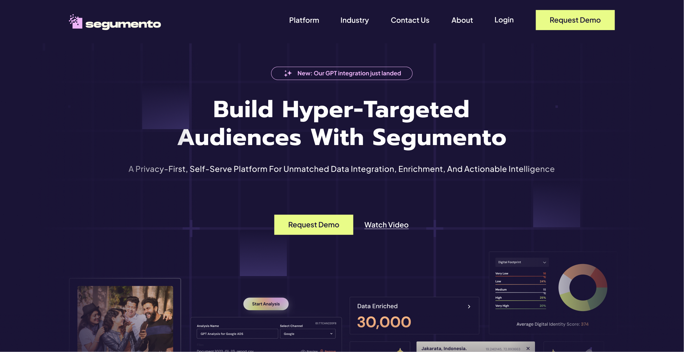
The UX design of Segumento strategically employs the ‘What, Why, and How’ framework. The initial home page clearly defines what the platform does – empowering business growth through customer intelligence.
Progressing through the content, the why behind this approach (building hyper-targeted audiences for better results) is explained. Finally, the detailed offerings, use cases, and workflow illustrate how Segumento achieves this success, providing a comprehensive understanding of the product’s value proposition.”
What’s the platform about
Immediately communicates Segumento’s core value growing business and revenue through customer intelligence and data-driven audiences.
Explicit Offerings
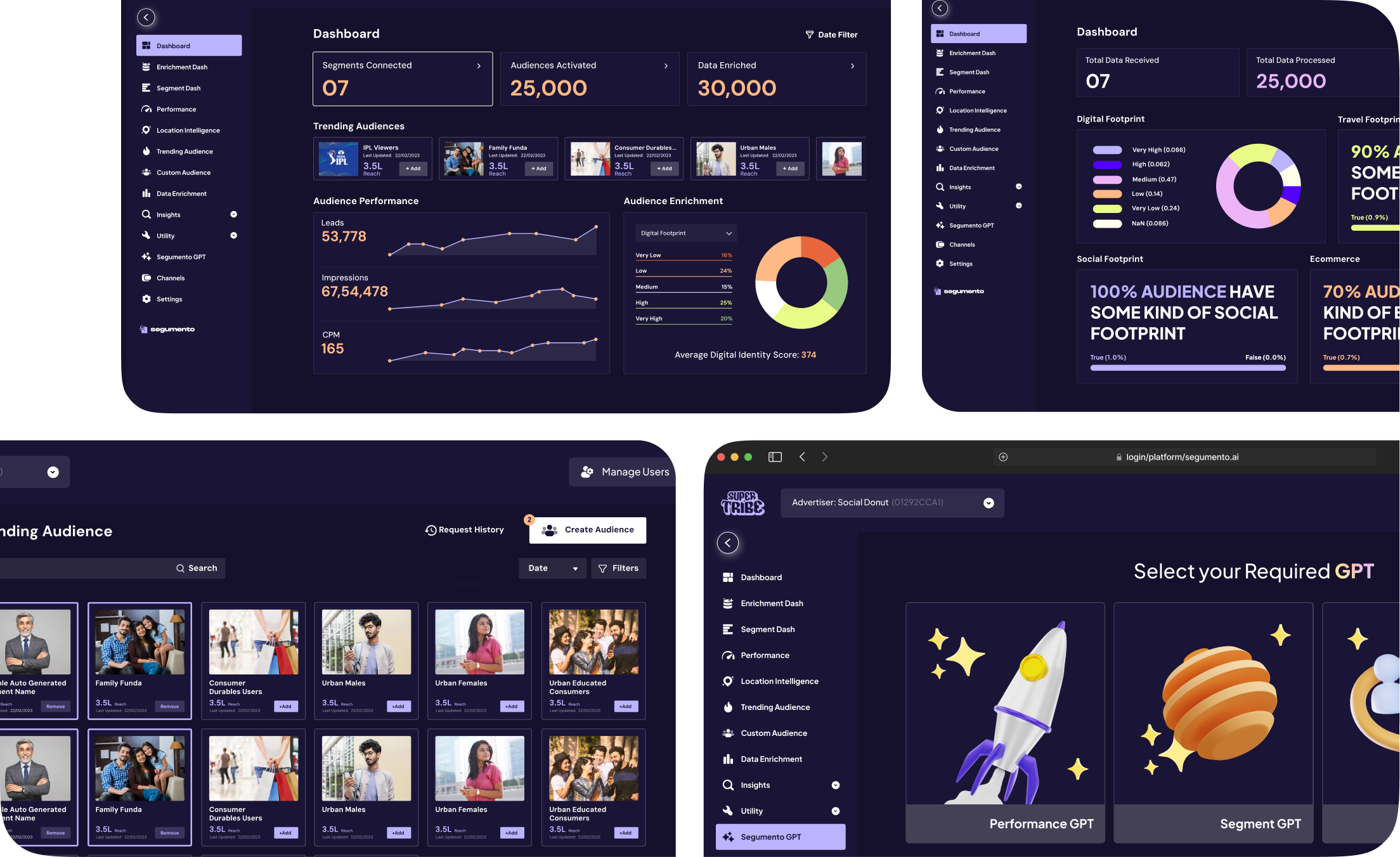
Clearly lists features like Audience Activation and Customer Insights, ensuring users quickly understand the platform’s capabilities.
Building trust factor through Case studies
Showcases use cases and case studies demonstrating Segumento’s real-world effectiveness and results.
Customer Stories for human touch
Integrates customer stories to build trust and make the platform feel relatable and impactful.
Showcasing Workflow
Explains how Segumento works and shares the company’s founding story to build user confidence and connection.
Colour Palette
Typography