Zimetrics

Zimetrics

Data Driving Limitless Outcomes

Zimetrics had established itself as a capable analytics and tech partner, but its old identity felt dated and regional. The logo lacked global appeal, modernity, and the ability to represent the limitless possibilities that Zimetrics delivers through data. To compete with global players and attract enterprise clients, they needed an identity that conveyed precision, innovation, and scale.

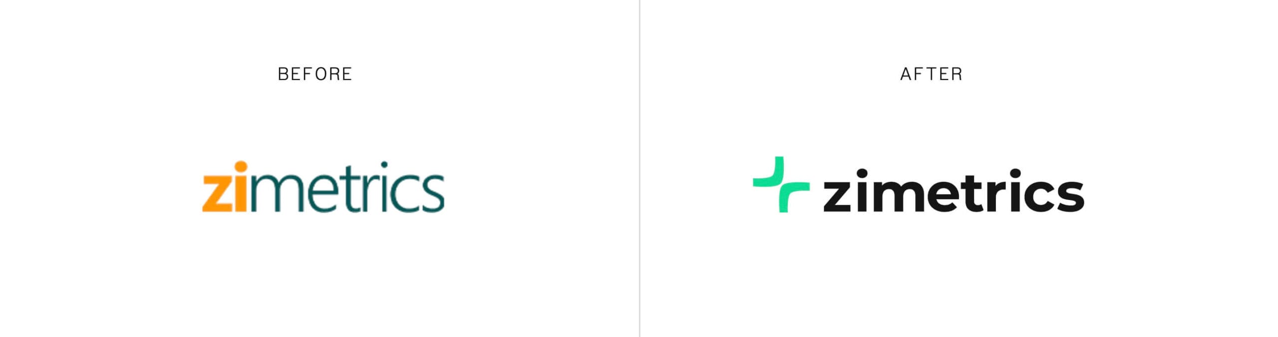
We dug deep into Zimetrics’ DNA — their mission of turning complex data into clear insights. The key insight was drawn from mathematics: the concept of limits tending to infinity, representing boundless growth and potential.

With this rebrand, Zimetrics stands stronger against global competitors and continues to expand its partnerships worldwide.

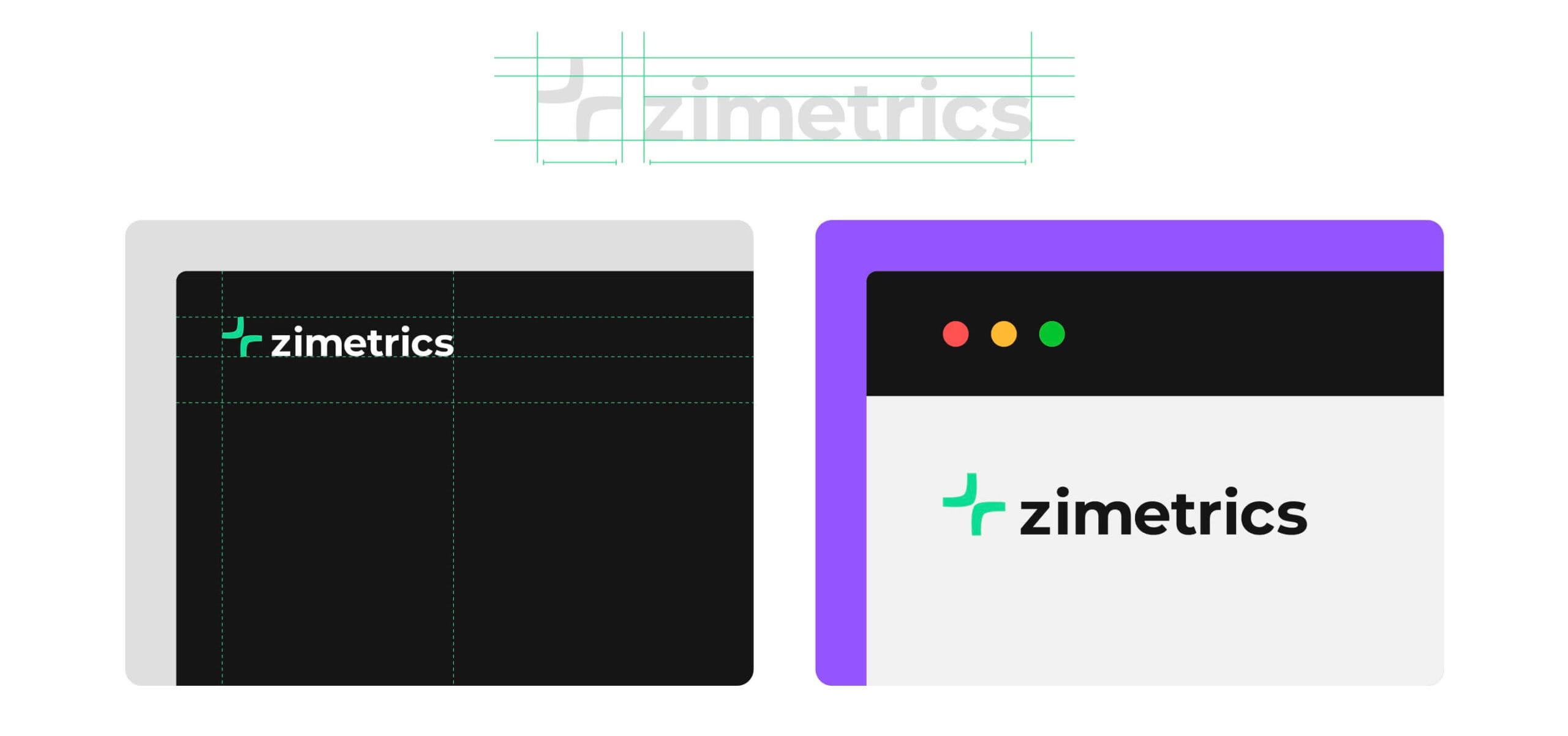
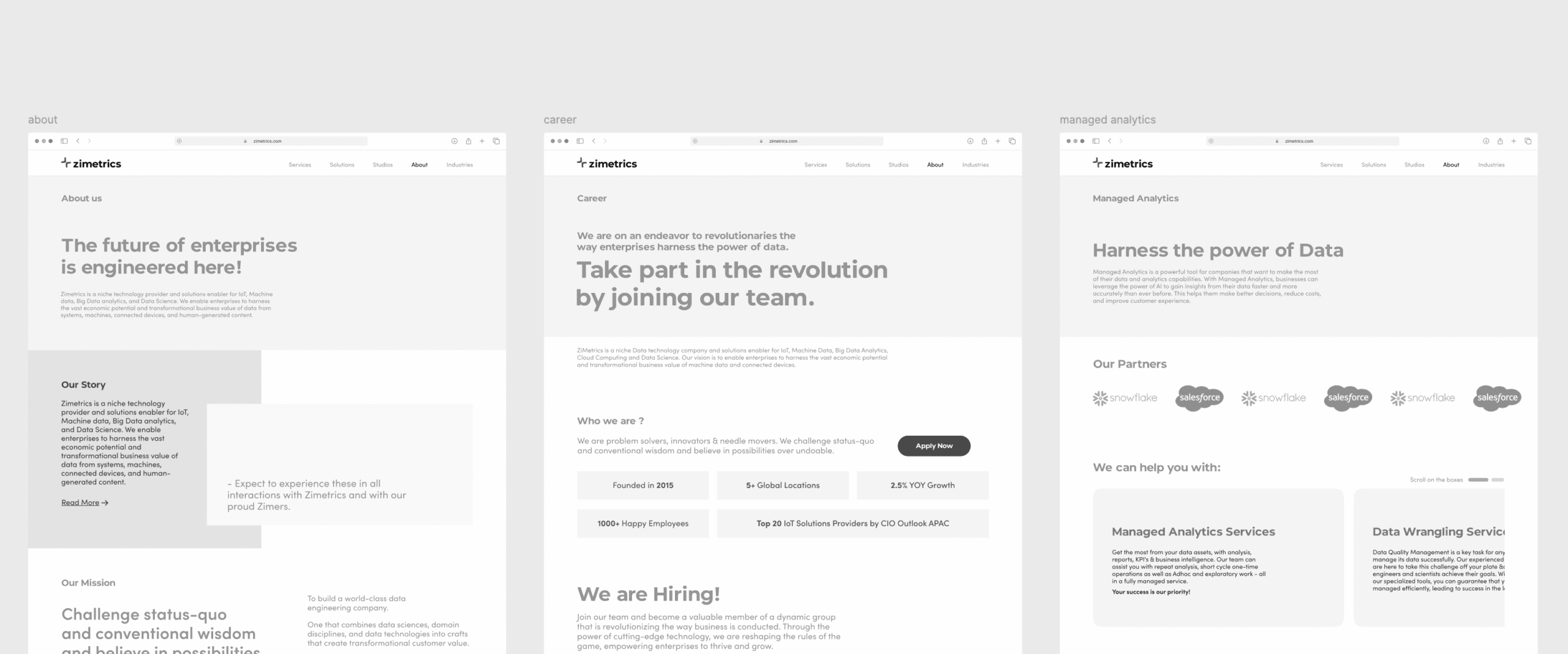
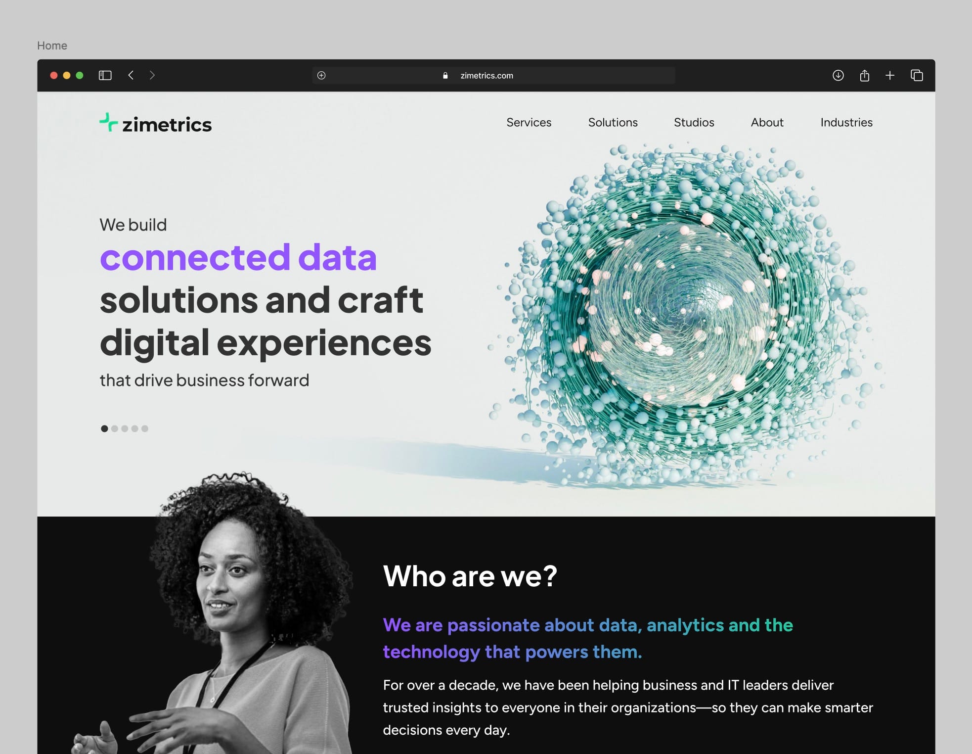
Crafted a logo inspired by the concept of infinity. Built a modern, scalable visual identity. Delivered brand guidelines for consistent rollout.

Narrativa

Narrativa Studio

Building better experiences for your next fintech.

Narrativa works with fintech brands to address product-market fit, execute go-to-market strategies and craft stories of their products and solutions with high-impact content (digital, print, visual, interactive) to build meaningful connections with their customers using the powerful tools of business storytelling.

The identity needed to Encompass the Dynamic DNA of the brand defined to place brand in a premium spot in the industry.

We were assigned the task of revamping the Website to reimagine the reading experience of the reader. Content and storytelling was at the center of it.

Blazeclan Reimagined

Blazeclan

ReImagineering your next cloud partner.

Blazeclan started out as born-in-cloud, cloud managed services provider based out of Pune in 2001. With a vision of becoming a global leader in Cloud Consultancy through thier invaluable and trustworthy customer service and experience.

What was needed with this new bold, dynamic identity system is a bold symbol. While it had to be bold, it was to be simple, replicable and distinct. While we did various iterations, we kept going back to a form, most dynamic in it shape!

From a basic building block, the identity takes various shapes that communicates not just the dynamism of Blazeclan but everything else that we stand for!

The basic card of our logo forms the building block of our identity, this can be further utilized to form intricate shapes that helps us to communicate more than just our identity.

The website had to be redesigned; to be aligned with the new branding identity. The Dynamic element was also a foundational principle in designing the UI.

This website uses cookies to ensure you get the best experience on our website.